The design of the book, that is to say, its aesthetic style apart from its content, was the part of the book that underwent the most development, and which gave me the most sleepless nights.
The first major decision I made was motivated by problems I had encountered during the creation of Vectis. Namely, that the final book, though aesthetically and conceptually pleasing, was far too expensive to actually reach any audience. Using print-on-demand technology, each single copy of Vectis costs somewhere in the region of £65; were it to be a hardback (which is practically essential for a commercial work of this expense that is not an extremely specialised work such a software manual) that price would rise to nearly £80. The only way to bring this price down would be to set up presses to do a large run, or to contact a publisher. The first is (at least for the foreseeable future) financially impossible, the second presents me with ethical and other problems.
Nearly the entire reason for the enormous cost of Vectis is the fact that it is in full colour, necessitating both vastly more expensive printing methods and more expensive paper compared to a black and white book. The cost per page for Vectis is about 7p; the cost of a page for a black and white book of comparable quality, on matter rather than glossy paper, is about 0.15p. Thus, from the beginning, I was considering how the costs of final printing of Utopia/Dystopia might be kept down. At first, I was considering the possibility of simply rendering the whole book in solid black and white. This design philosophy informed the creation of the first of the chapter title pages ('Sex') and ultimately all the chapter title pages, but I quickly decided that it would be restrictive for the entire book, though it would go on to have an extremely important indirect influence, as I will discuss below. First, I expanded myself to greyscale; then, as I began to think about how I might eventually display the book in my MA show, I hit upon the idea of designing the book so that it would function both in colour and in black and white, creating a commercial greyscale edition (which, in dustjacketed form, weighs in at a reasonable £12) and a more deluxe 'exhibition quality' colour work (which comes in at £45). This informed the design of the artwork and choice of colours throughout, and has been, I think, largely successful, although there a few parts that could do with tinkering.
Initially, I was considering an extremely spartan and conventional design, born out of the desire to make a 'proper book' for once. This seemed also to continue an arc that had been developing throughout my printed books, of a refinement and increased subtlety in design, developing through from the extreme eccentricity of What is a Book? through to Vectis (which dared to be actually readable) to this project. This early view of a page from Heaven/Hell gives some idea of just how conventional I was thinking in the first stages:

There was something pleasing about the simplicity; particularly, I was interested in how it gave me room to play with flatness and emptiness in a way that was impossible in Vectis, which had featured photographs, artwork and detailed, vivid backgrounds bleeding from the edge of every page. At this stage, seeing as I was planning on printing the work myself, I was specifically avoiding full bleeds, which have caused me endless problems on my (fairly basic) home equipment. The first major change I made to this format was the addition of a subtle grey box on every page:


Although subtle, you can also notice the first appearance of the white bars dividing the boxes here. I continued designing the book along these lines, adding and playing with content, for some time, but it remained always unsatisfactory; I knew that it was only a temporary solution, or the core of a better idea.
The first big breakthrough came with the decision that I was going to make a version of the book in colour. This suggested the possibility of adopting a colour scheme to mark out the different sections of the book, as I had done with Vectis. This was also the time where I made the decision to get the book printed commercially, thus opening up once more the possibility of full bleeds. The coloured tabs, which instantly became one of the most distinctive visual features of the book, arose naturally, though the final choice of colours for each section involved several days of pondering and twitching CMYK sliders.

In the above example, you can also see another design feature that appeared at this time; decorative white forms, blending into the background, taken from sections of the chapter headers. These never really worked, but some remained, albeit in even subtle form, for much of the process, finding themselves in the final book only in the form of the crucifix shaped word-clouds in the background of the timeline in Heaven/Hell. In a future version of the book, I might remove them altogether, but for the moment, they stand.
Throughout these early stages, beginning with the decision to introduce greyscale, I was also considering the knotty problem of designing the visual essays, particularly Sex/Death, which, being the first one I attempted (and the only one to completely use the cut-out style I developed), was the longest and most complicated to produce. The first iteration was simply the same as the text sections, but with images.

The letter R, overlaid over the image, was the reference for the page containing the image sources (the concept of using a different numbering scheme for each section only coming in, in a flash of inspiration, with the coloured tabs). I kept the images in colour because, at this time, I was considering that the visual essays might be special colour sections. The image source page itself was more spartan, though it certainly contained the seeds of its current form:

These sections changed little, until the design overhaul that revolutionised the whole appearance of the book, inspiring a massive spurt of work from me as my confidence in the final product increased overnight. The source of the change was the simple act of clicking a button to see what the ubiquitous grey boxes would look like with a black border. For a long time, I had been resisting the notion of solid borders, for reasons that are now not quite clear to me. For some reason, I worried that it might be crass, and tried to find some way of letting large, flat areas of colour and grey work together in a painterly fashion. The addition of the black border changed everything. Particularly, it caused me to start visualising the grey boxes as 'floating' above the coloured tabs, prompting the detail of the white lines across the page turning into separate little grey boxes, with the colour tab visible behind the join, which I still consider to be one of the most visually pleasing details of the book.

As the book moves through the three 'text' sections, the use of fonts, and the way text and image are balanced, changes with each section. In Heaven/Hell the images are separate illustrations to block text, and various Morrisonian features, such as decorative initials, are in full evidence. In Culture/Nature, the design becomes cleaner and more modern, and the structure mimics one that I used to good effect in Vectis, a simultaneous and inter-related but seperate system relating and opposing images and text, which I shall discuss in more detail in the section on content. This section uses sans-serif exclusively, and Magic/Politics mostly relies on this text, though used more creatively. In that section, I have gone for a more fluid inter-relationship between text, image and decoration, that fits in with the more esoteric subject matter of this section. This section also breaks somewhat with the principles of colour established in the other sections, where the scheme is dominated by the sidebars and a second colour derived from the sidebars, though it reflects the general colour scheme of greys and pale pastels. The visual essays follow a much more consistent pattern, though there is a degree of development. The first essay, Sex/Death, uses cut out icons, separated from their original context. The second essay, Drugs/Religion, uses complete images, and the third, Order/Chaos, uses a mixture of the two, as well as introducing images that stretch across two pages.

The depth of the shade in this box gradually increased in intensity throughout Heaven/Hell, stayedd at one level for Sex/Death, then dropped back down again, undulating throughout the rest of the book, meant to help create a rhythm. This idea was eventually abandoned, with most of the books greys being scaled back to a 25% black CMYK process grey (perhaps the most beautiful 'pure' grey, to my eyes anyway), though there are points where this varies, either subtly or dramatically, for a range of reasons. Eventually, this box would be the backbone off which the entire book would be designed, but only after a brief, but important, diversion.
Thinking about designing an impressive book in black and white, and the concept of Utopia, naturally lead me, almost inexorably, towards the works of Utopian socialist, and master book-designer, William Morris. Leafing through facsimile editions of his masterworks, such as a the Kelmscott Chaucer, I fell completely in love (as I always do when I come back to Morris) and began to consider the possibility of doing something in a similar vein. I did a few experiments, combining decorative borders (actually taken from Morris's work, though I was intending at some point to design my own) with elements of my own style and some of the content, but it seemed to fall a bit flat, so I returned to what I had previously been doing.

Returning to the grey box, I began to think about what ideas I might take from the Morrisonian 'Book Beautiful'. I started fairly simply. with feaures such as the decorative initials, which were (for a very large part of the book's production process) much more elaborate.

The first big breakthrough came with the decision that I was going to make a version of the book in colour. This suggested the possibility of adopting a colour scheme to mark out the different sections of the book, as I had done with Vectis. This was also the time where I made the decision to get the book printed commercially, thus opening up once more the possibility of full bleeds. The coloured tabs, which instantly became one of the most distinctive visual features of the book, arose naturally, though the final choice of colours for each section involved several days of pondering and twitching CMYK sliders.

In the above example, you can also see another design feature that appeared at this time; decorative white forms, blending into the background, taken from sections of the chapter headers. These never really worked, but some remained, albeit in even subtle form, for much of the process, finding themselves in the final book only in the form of the crucifix shaped word-clouds in the background of the timeline in Heaven/Hell. In a future version of the book, I might remove them altogether, but for the moment, they stand.
Throughout these early stages, beginning with the decision to introduce greyscale, I was also considering the knotty problem of designing the visual essays, particularly Sex/Death, which, being the first one I attempted (and the only one to completely use the cut-out style I developed), was the longest and most complicated to produce. The first iteration was simply the same as the text sections, but with images.
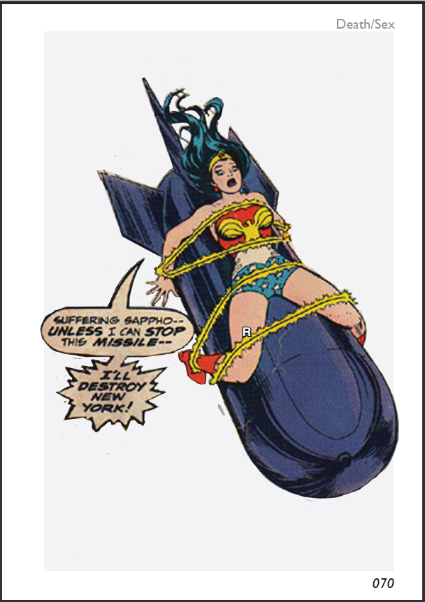
The letter R, overlaid over the image, was the reference for the page containing the image sources (the concept of using a different numbering scheme for each section only coming in, in a flash of inspiration, with the coloured tabs). I kept the images in colour because, at this time, I was considering that the visual essays might be special colour sections. The image source page itself was more spartan, though it certainly contained the seeds of its current form:

These sections changed little, until the design overhaul that revolutionised the whole appearance of the book, inspiring a massive spurt of work from me as my confidence in the final product increased overnight. The source of the change was the simple act of clicking a button to see what the ubiquitous grey boxes would look like with a black border. For a long time, I had been resisting the notion of solid borders, for reasons that are now not quite clear to me. For some reason, I worried that it might be crass, and tried to find some way of letting large, flat areas of colour and grey work together in a painterly fashion. The addition of the black border changed everything. Particularly, it caused me to start visualising the grey boxes as 'floating' above the coloured tabs, prompting the detail of the white lines across the page turning into separate little grey boxes, with the colour tab visible behind the join, which I still consider to be one of the most visually pleasing details of the book.

As you can see in the above example, the black border also made me think a lot more about the cut-out figures in relation to the grey backdrop, and prompted a lot of interesting play with the way that the figures either emerged from or broke through the borders, which help to make Sex/Death one of the more visually exciting of the sections, in my opinion. The only major change left to make to this section for it to reach its final form was the addition of a black border around the cut-out figures, the result of a successful 'what if?' aesthetic experiment.
With this basis laid down, the next major decision was whether to differentiate the various sections of the book visually, and if so how. In previous books, I have used dramatically different visual styles in different sections. In Utopia/Dystopia, however, I have decided to go for a more subtle variation in design, keeping features such as the sidebars and the central box consistent throughout, whilst changing other features. I have paid particular attention to the use of fonts. The fonts change subtly throughout the book, particularly the fonts used for large block of texts, though a consistency is achieved by the use of a particular weight of Helvetica (Narrow Bold) for all titles and other pieces of significant text, and the use of Gill Sans MT for the page numbers, in all sections except for Magic/Politics, where the use of the Babylonian numbering system required custom graphics. The rest of the book uses a considered mixture of Aparajita, Plantagenet Cherokee and Cambria for serif text, with Bodoni MT and Lucida Fax in specific applications (the names accompanying the portraits and the text of the image source pages respectively) and a careful assortment of Helvetica and Calibri in various weights for sans-serif. Experiments with more exotic fonts (various sorts of fraktur, blackletter and celtic typefaces) in order to evoke the Book Beautiful felt mis-placed and unsuccessful. The final design echoes various features of the Book Beautiful, but in clean, modernist garb.

